Ocean Motion Teacher Guide Lesson 5
Patterns of
Ocean Energy Balance
Table of Contents
Click the titles below to jump through the lesson
Energy Flow In The Earth System
Gathering And Manipulating Data
Joyful Data Graphing And Finding The Mean
Standard Deviation For The Courageous
Air Temperature Investigations
Temperatures Travel The Pathways Of The Sea

Lesson Objectives |
Performance Tasks |
|---|---|
To understand the need for measurement protocols and ways to compute statistical measures of data. |
Compute the means and standard deviation of data values and interpret their significance. |
To use the human body as a model to understand energy balance in the Earth system. |
Identify parts of the energy balancing mechanisms of the Earth and compare their function to energy regulation functions of the human body. |
To demonstrate an understanding of patterns of the diurnal heating and cooling cycle of the atmosphere. |
Compare patterns of diurnal heating and cooling of the atmosphere to predictions of a Daily Metabolism model. |
To investigate fluctuations of solar energy received on Earth. |
Determine when solar intensity is highest and lowest at various sites on Earth using global images showing daily incident energy. |
To understand important patterns of sea surface temperatures and ocean surface currents. |
Identify patterns in sea surface current and temperature data. |
Materials:
Teacher and Student Guides
Internet access
Computer with web browser
Number of Pages: 20
Grade Level: high school, Levels 1 & 2
Courses Supported: Math, Earth Science, Physics, Geography
Glossary: conduction, convection, global warming, mean, median, sea surface temperature
Introduction: Energy Flow In The Earth System
Scientists
are concerned about global 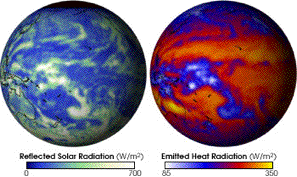 warming due to changes in the flows of energy through the Earth
system. The ocean plays an important role in determining and moderating the
effects of an energy imbalance. The physical properties, large-scale movements
and global distribution of the ocean make it a key indicator of changes in
Earth's temperature and energy balance. The ocean is not a passive thermometer.
Instead it manages and distributes stored solar energy to all regions of the
planet. It is essential that scientists look for evidence of stability, change
and variability not only in ocean surface temperatures but also in the major
currents that redistribute the energy.
warming due to changes in the flows of energy through the Earth
system. The ocean plays an important role in determining and moderating the
effects of an energy imbalance. The physical properties, large-scale movements
and global distribution of the ocean make it a key indicator of changes in
Earth's temperature and energy balance. The ocean is not a passive thermometer.
Instead it manages and distributes stored solar energy to all regions of the
planet. It is essential that scientists look for evidence of stability, change
and variability not only in ocean surface temperatures but also in the major
currents that redistribute the energy.
Data Image and description: http://www.nasa.gov/vision/earth/environment/earth_energy.html
The top 3-5 meters of ocean surface water has the same heat capacity as the entire atmosphere above it. It takes 3.7 times as much energy to heat one kilogram of seawater by one degree Celsius than to heat one kilogram of air by the same amount. In addition, one kilogram of air (at standard temperature and pressure) occupies 795 times more volume than 1 kilogram of seawater. So a given amount of heat energy will raise the temperature of 2,940 cubic meters of air and one cubic meter of seawater by the same amount. Because the ocean surface is always in contact with the atmosphere, the ocean surface can act as a very effective heat storage medium for the atmosphere. Small changes in ocean surface temperature can indicate large exchanges of energy with the atmosphere.
Engage: Preconceptions Survey, “What Do You Know?”
Students are asked to take an online ![]() consisting of ten questions. When they submit their responses
online, a pop-up window appears that shows the correct response to each
question and provides additional, clarifying information. All nine questions,
the correct responses and additional information are provided below.
consisting of ten questions. When they submit their responses
online, a pop-up window appears that shows the correct response to each
question and provides additional, clarifying information. All nine questions,
the correct responses and additional information are provided below.
Engagement activities such as this one are typically not graded.
True
or |
Statement |
1 True |
The primary source of energy for ocean and atmosphere circulation and the biosphere is the Sun’s radiation. The Sun provides 1.7 x 10¹⁷ Watts of power (Joules of energy each second) in the form of radiation that is intercepted by Earth. Some of this energy is reflected and some is absorbed. |
2 False |
Earth is always in energy balance: energy received (primarily from the Sun) equals energy emitted. At any instant, energy received and emitted by Earth can be unbalanced. If energy received is greater than emitted, the temperature of Earth will rise. If energy emitted exceeds energy received, then temperatures will fall. Conservation of energy requires that the total energy at all times be the same temporal and spatial imbalances can occur. (Although the buildup of greenhouse gases is shifting the balance.) |
3 False |
Our climate determines the energy balance of Earth. The opposite is true. Earth's energy balance determines our climate. Over a sufficiently long time period, incident energy must equal its emitted energy. In case of an imbalance, the temperature of Earth will increase or decrease until the energy flows become equal. Temperature is the primary determinant of our climate. |
4 False |
The average temperature of Earth has been constant over time. Earth's average temperature has varied significantly over the past several hundred thousand years. Past temperatures can be estimated from various sources of data: for example, tree-ring widths, coral growth and isotope variations in glacier ice cores. Variations in Earth’s motion and orientation may be responsible in large measure for these past climate changes. |
5 True |
The higher the temperature of an object or substance, the greater the intensity of radiation it emits. All objects produce radiation in proportion to the fourth power of their absolute (Kelvin) temperature. The Kelvin (K) temperature is 273.15 + Celsius temperature. At room temperature of 20 degrees Celsius the Kelvin temperature is 293 degrees. Relatively cool objects like the Earth emit radiation, most of which is not visible. Hotter objects like the Sun with surface temperatures in the range 5,000-6,000 degrees Kelvin radiate much of their energy in the visible radiation range. Our eyes are most sensitive to the emissions of our local star, the Sun. |
6 False |
Water vapor in the atmosphere cools Earth. Water vapor is a prominent greenhouse gas that is transparent to much of the Sun’s radiation, but acts as a blanket absorbing some of the infrared radiation emitted by Earth. This blanketing effect warms Earth and makes it more habitable. If the water vapor changes phase (condenses to water droplets or freezes to ice crystals) then clouds will form and these will have both cooling (sun blocking) and warming (blanketing) effects. |
7 False |
In July, Earth is closest to the Sun. Earth is closest to the Sun in January and farthest in July. Most of the seasonal changes that we observe throughout a year are due to the tilt of Earth’s axis of rotation. The axis is tilted at 23 degrees to the plane of orbit and points towards Polaris, the North Star. During winter in the United States, the Northern Hemisphere is tilted away from the Sun. Six months later on the opposite side of Earth's orbit, the Northern Hemisphere tilts towards the Sun and experiences summer. |
8 True |
Sea surface temperature and currents are used to make forecasts of fishing conditions in the ocean. Each species of fish seeks out waters in a temperature range that suits its metabolism, biochemistry and feeding habits. Fishermen can access fishing forecasts based on maps of surface temperature, currents, phytoplankton and other environmental conditions to track down specific fish species. Fish seek out water that has food. For example, warm water is more suitable for tuna, but tuna are often found at the edges of cold eddys because their prey prefer cold water. |
9 False |
Satellites in space measure the temperature of ocean water by its color: light blue is warm and dark blue is cool. Temperature does not affect the color of water. Satellites measure the intensity of invisible radiation emitted by the sea surface to determine sea surface temperature. The data gathered are in black and white. Color tables are created and applied to the data. These colors do not represent the colors as seen by our eyes, but instead represent data values. Recall that the Kelvin temperature of an object determines the energy that it radiates. Inversely, the radiation from an object (the sea surface) may be used to remotely determine its temperature from a satellite. |
100 |
Overall Score (%) |
Explore: Gathering And Manipulating Data
Basic Data Gathering and Processing
When studying the ocean, scientists use automated instruments such as buoys and satellites to collect data. These measuring tools are very accurate and stable, but they also can be as prone to error and uncertainty as the thermometer you hang outside your window.
Scientists realize they can never make perfect measurements. Instead they try to be as accurate as possible within the limitations of their measuring instruments and their protocols (i.e., the set of procedures scientists follow for every measurement). They consider a measurement that is close to the true value an accurate measurement. Random uncertainties can cause these measurements either to be too high or too low. Such uncertainties must not be systematic. In other words, the measurements should not be consistently higher or lower than the true values. Scientists therefore must constantly reevaluate the uncertainties that affect their measurements and the conditions under which the measurements are made. Following measurement protocols insures as much accuracy and reproducibility as possible.
1. Students may form teams (or work individually) and use a thermometer to measure the temperature of water in a cup or deep bowl. Each student (or team of students) should record their name(s), the temperatures they measure and any comments they may have about their measurements (scientists call these comments metadata) on a board or poster for all to see.
Copy the results of the measurements along with any student comments in the table below:
Name |
TemperatureValue |
Comments/Metadata |
|---|---|---|
2. Compare the measurements of the water temperature. Are all the measurements the same or nearly the same?
Typically student measurements and comments about their measurements will vary. Some of the temperature measurements may be similar. Most people would judge the mean or average of these similar values to be the actual temperature of the water. Values that disagree greatly with most other measured values will tend to be discarded or ignored, often without understanding the real reason why these measurements differ from the norm.
3. List some of the factors that might cause the temperature measurements to differ?
• The thermometer might not be left in the water for enough time to give a steady reading.
• The thermometer might be hand held instead of on a string so it is warmed by body heat.
• Measurements may be made using different units (Fahrenheit vs. Celsius scale).
• The thermometers might be read at different depths and times. The water in the bowl might be colder on the bottom and lose or gain heat over time in the room.
• The thermometer might be read after pulling it out of the water. In this case students may be measuring the air temperature rather than the water temperature.
• The thermometers might not be correctly adjusted or calibrated to give correct readings.
4. Create a protocol (or procedure) to measure the temperature of water in a nearby pond, lake or ocean. The protocol should have enough detail so that any student following the protocol will measure the same (or very nearly the same) value.
The protocol could specify how the thermometer is held, the minimum length of time it is in the water, the depth of the thermometer bulb, the time of day (or sampling interval) for the measurements and a method for thermometer calibration. A 50-50 mix of ice and distilled water should give a Celsius reading of 0o C. The thermometer should be immersed in the slushy mix but not touch the bottom of the container. Thermometers that do not read 0o C in this mix should be discarded or carefully calibrated with at least two calibration points. Water’s boiling point (corrected for the school site barometric pressure) may be used as a second calibration point. The student-developed protocol could include suggestions for recording environmental metadata about the measurement, including date, cloud cover and wind conditions.
Joyful Data Graphing And Finding The Mean
Assume that 15 water temperatures were collected with a calibrated thermometer.
Each of the following five processing steps may help you to better understand characteristics of the data collected.
Graph the Data: The temperature data points make a pattern that seems to be level – not slanted up or down. If the points showed a systematic trend rising or falling from left to right, it would suggest that the “true” value being measured was systematically changing during the measurements. In this case, the measurement protocol should be re-examined and revised.

Expand the Graph Scale: To see the variations in the data more clearly, expand (magnify) the data scale. The data points look different but correspond to the same values.

Compute the Mean: Add all temperature measurements and divide by the number of points (15) to compute the mean value of the data. The red line in the figure shows the mean value. Its value is just above 21o. The mean value line does not exactly intersect any of the temperature data points but it lies in the middle of the data points (7 above the line, 8 below).

Compute the Differences from the Mean: Compute the difference between each data point and the mean value. This will be used to estimate the variation in this set of measurements.

Compute the Standard Deviation: Use all the differences to compute the standard deviation (σ) of the data set. The red lines show the limits of the [mean + σ] and [mean – σ]. Note that 10 data points lie between these limits and 5 lie outside:
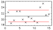
Within limits: 10/15 = 2/3 = 67% of the data set
Outside limits: 5/15 = 1/3 = 33% of the data set
The method for calculating the standard deviation is discussed below.
Standard Deviation For The Courageous
Level 2, More Challenging
Here is an exercise where you will practice calculating the mean and standard deviation of data values. Imagine that you have measured the following temperatures 27.4oC, 26.5oC, 28.1oC, 27.6oC, 26.9oC and you wish to compute the mean and standard deviation of your data. Organize the data into a table (Column A) and perform calculations as discussed in the steps below. Follow the flow and method of this example and then you will practice the calculations yourself:
Column A Data |
Column B Difference |
Column C Squared Difference |
|
XI |
XI-XM |
(XI-XM)2 |
|
1 |
27.4 |
(27.4-27.3)=0.1 |
(0.1)2=0.01 |
2 |
26.5 |
(26.5-27.3)=-0.8 |
(-0.8)2=0.64 |
3 |
28.1 |
(28.1-27.3)=0.8 |
(0.8)2=0.64 |
4 |
27.6 |
(27.6-27.3)=0.3 |
(0.3)2=0.09 |
5 |
26.9 |
(26.9-27.3)=-0.4 |
(-0.4)2=0.16 |
SUM |
Sum of Data
|
Sum of Squares
|
|
MSD |
Mean Value
|
Standard Deviation
|
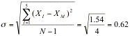
• List the data as in Column A
• Add all the data values and record the sum in the SUM row of Column A.
![]()
• Compute the mean by dividing the sum (from Step 2) by the number of measurements (N=5). Record this result in the MSD (Mean and Standard Deviation) row of Column A.
• Subtract the mean value (Step 3) from each data value as shown in Column B.
• Compute the square of each difference value from Column B and record it in Column C.
• Add all the squared differences from Column C (Step 5) and record the sum in the SUM row of Column C.
![]()
• Compute the standard deviation by taking the square root of the sum of the squared differences (Step 6) divided by one less that the number of measurements (N-1 = 5-1 = 4). Record this result in the MSD row of Column C.
The mean and the standard deviation are related in a very important way. For a given data set, the mean is the single value that minimizes the standard deviation of the data. Choosing any value other than the mean for calculating the standard deviation yields a larger standard deviation. If, for example, you replace the mean value 27.3 with 28.0 everywhere in the above calculation, you will find that the standard deviation increases. In this sense, choosing the mean value as the best value to represent a dataset is justified by the fact that it
deviates (differs) least from the other numbers in the dataset.
5. Your Turn: The following is a new dataset. Practice the calculation of mean and standard deviation values:
Column A Data |
Column B Difference |
Column C Squared Difference |
|
|---|---|---|---|
XI |
XI-XM |
(XI-XM)2 |
|
1 |
4.73 |
-0.01 |
0.0001 OR 1.0E-4 |
2 |
4.65 |
-0.09 |
0.0081 OR 8.1E-3 |
3 |
4.82 |
0.08 |
0.0064 OR 6.4E-3 |
4 |
4.70 |
-0.04 |
0.0016 OR 1.6E-3 |
5 |
4.69 |
-0.05 |
0.0025 OR 2.5E-3 |
6 |
4.83 |
-0.09 |
0.0081 OR 8.1E-3 |
7 |
4.77 |
0.03 |
0.0009 OR 9.0E-4 |
SUM |
Sum of Data
33.19 |
Sum of Squares
0.0277 |
|
MSD |
Mean Value
4.74 |
Standard Deviation
0.068 |


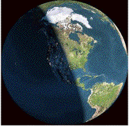
The sun rises over Europe and
Northern Africa.
By The Living Earth
http://www.fourmilab.ch/earthview/
Explore: Energy In = Energy Out
How can a model of the human body be used to better understand energy in the Earth system?
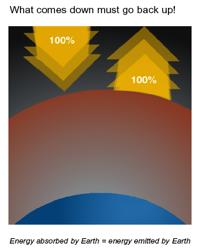
Energy balance is a familiar topic to most people because it relates directly to their health. Your body maintains an energy balance:
Energy In = Energy Out + Energy Stored
The above formula illustrates energy conservation—all the energy has to “go” somewhere. It cannot just disappear. Humans eat food that provides energy for biochemical processes necessary for life and for heat that the body sheds through various processes (radiation, conduction, convection and evaporation). The unit of energy found on food package labels is the Calorie (1 Calorie = 1000 calories = 4186 Joules). The body regulates blood flow to increase or decrease body heat. If too many calories are consumed, the body stores the excess energy as fat.
6. In the chart below, complete the following analogies that compare the energy balance of the body to that of the Earth.
Energy |
Human Body |
Atmosphere/Ocean |
|---|---|---|
Primary energy source |
Food |
Sun |
Ways the energy is expended |
Exercise, work, internal body functions |
Winds, storms, currents, photosynthesis |
Ways the energy is stored |
Fat accumulation, chemical energy |
Latent heat, thermal energy, chemical energy |
Ways to transfer energy |
Evaporation (sweat), conduction, convection (blood circulation)(hmm. The blood is pumped through the body, carrying heat), radiation |
Evaporation, radiation, conduction, convection (air and water currents) |
Explore: Air Temperature Investigations
What do data reveal about daily energy cycles in the Earth system?
Sun rise over North America.
By The Living Earth
http://www.fourmilab.ch/earthview/
To investigate energy cycles, begin by examining air temperature data collected in Washington, DC on July 4–5, 2005 – a calm, clear summer day in the nation’s capital. On July 3, the Earth is farthest from the sun—94,500,000 miles (in the first week of January, Earth is closest—91,400,00 miles). Many of the details that you will learn about this daily energy cycle will apply to the yearly cycle of ocean surface temperatures as well. The daily cycle occurs because Earth rotates once on its axis every 24 hours. The yearly seasonal cycle occurs because the Earth’s axis is tilted 23o relative to the plane of its orbit. As Earth orbits the Sun, this tilt remains constant, so the United States experiences winter when the Northern Hemisphere tilts away from the Sun and summer when it tilts towards the Sun.
The graph below represents outside air temperatures for July 4–5, 2005 in Washington, D.C. For this investigation, we have selected a calm, clear day with no precipitation or significant movement of air masses. Examine the graph and answer the following three questions.

7. Determine the maximum temperature and the time and date it occurred.
Max Temp: 30.2oC
Time: 5 pm
Date: July 4, 2005
8. Determine the minimum temperature and the time and date it occurred.
Min Temp: 21.9oC
Time: 8 am
Date: July 4
9. What is the temperature range shown in the graph?
The temperature range was 8.3 °C (30.2 - 21.9).
During the entire 24-hour interval, the Kelvin (absolute) air temperature was relatively constant:
30.2oC (max temp) = 30.2 + 273.15 = 303.35oK
21.9oC (min temp) = 21.9 + 273.15 = 295.05oK.
Measured on this scale, the Kelvin temperature of the air changed by less than 3% over
24 hours:
![]()
The energy radiated by a substance or object depends directly on its Kelvin temperature. Objects with a higher temperature radiate more. Assuming that the nearby ground surfaces have temperatures similar to the air temperatures, it can be concluded that during the 24-hour period, the electromagnetic energy radiated around the site of this Washington, D.C. weather station site was fairly constant.
The following graph shows the intensity of solar radiation measured in Watts per square meter received at the Washington, D.C., weather station. A Watt is a unit of power that measures energy used or generated per second: 1 Watt = 1 Joule/1 second = (1/746) horsepower. A typical light bulb in the home is rated at 75 Watts. As shown by the graph, solar intensity varies significantly throughout the day. The intensity reaches its peak near noon and is zero between 8:30 pm and 6 am when Washington, D.C., is not receiving direct light from the Sun).

10. Compare the two graphs Outside Temperature, (page 9), and Solar Radiation, (page 10). Describe what happened to the air temperature and solar radiation during the afternoon and early evening between 2 pm and 8 pm. Air temperature increased until 5 pm then started decreasing. Solar radiation decreased continuously during the next 6 hours. Air temperature continued to rise as the incoming radiation (gain) exceeded the loss from emitted radiation.
11. Why was the solar radiation zero between 8:30 pm and 6 am? Examine the Outside Temperature data and describe what happened to the air temperature during this time interval. The solar radiation was zero because there was no direct solar radiation at night. The air temperature decreased at a steady rate during this time interval. Assuming that atmospheric conditions were stable and calm, this temperature decrease was mainly due to steady energy loss due to emitted radiation. This steady rate of loss reflects the fact that the Kelvin temperature of the air and its surroundings underwent a small percent change during the night.
Why Is There a Time Delay? Based on the graphs, there is a delay in the temperature response to the Sun’s energy. Air temperatures continue to rise and remain steady for hours after the solar radiation reaches its peak. Why?
To investigate this question, you will use a simple daily energy balance model that receives incoming energy that peaks around Noon and that emits energy at a steady rate (the same amount of energy is lost during each hour). The following table lists information about the model:
• Column A: Time of day (starting at 1 AM)
• Column B: Incoming (incident solar) Energy (IE) is zero at night and peaks near Noon.
• Column C: Emitted (radiated infrared) Energy (EE). This remains constant at all hours, reflecting the relatively constant temperature of the environment.
• Column D: Total (thermal) Energy (TE). The total energy is the amount of thermal energy that accumulates throughout the day. Incoming Energy makes it higher. Emitted Energy makes it lower.
The model starts with 9 units of energy (Total Energy in Column D) in the air and environment at 1 am. Between 1 AM and 2 AM, no incoming energy is added; however 1 unit is emitted, leaving 8 units of energy:
TE (2 AM) = TE (1 AM) + IE (1 AM) – EE (1 AM) = __8__
Fill in the remaining TE values using this same iterative method of calculation:
12. TE (3 AM) = TE (2 AM) + IE (2 AM) – EE (2 AM
Daily Energy Balance Model |
||||
Column A Time of Day |
Column B Incoming Energy (IE) |
Column C Emitted Energy (EE) |
Column D Total Energy (TE) |
|
|---|---|---|---|---|
AM |
1 |
0 |
1 |
9 |
2 |
0 |
1 |
8 |
|
3 |
0 |
1 |
7 |
|
4 |
0 |
1 |
6 |
|
5 |
0 |
1 |
5 |
|
6 |
0 |
1 |
4 |
|
7 |
1 |
1 |
4 |
|
8 |
1 |
1 |
4 |
|
9 |
2 |
1 |
5 |
|
10 |
3 |
1 |
7 |
|
11 |
3 |
1 |
9 |
|
Noon |
4 |
1 |
12 |
|
PM |
1 |
3 |
1 |
14 |
2 |
3 |
1 |
16 |
|
3 |
2 |
1 |
17 |
|
4 |
1 |
1 |
17 |
|
5 |
1 |
1 |
17 |
|
6 |
0 |
1 |
16 |
|
7 |
0 |
1 |
15 |
|
8 |
0 |
1 |
14 |
|
9 |
0 |
1 |
13 |
|
10 |
0 |
1 |
12 |
|
11 |
0 |
1 |
11 |
|
Midnight |
0 |
1 |
10 |
|
By 1 AM, total energy (TE) will be back to 9 units and the same energy cycle will repeat for this ideal, balanced case. For any one location and date on Earth, the energy flows do not have to always be in balance. Balance applies to the entire Earth over an extended period of time. In our example, if the incoming energy (IE) increases significantly, then Earth’s surface temperatures will rise and the emitted energy (EE) will increase. The amount of emitted energy will naturally adjust to compensate for increases (or decreases) in incident energy.
Explain: 13. Look at the energy values in the table above. When does incoming energy (column B) reach its minimum, its maximum? Does the emitted energy (column C) show a maximum or minimum value? When does total energy (column D) reach its minimum and its maximum?
Daily Energy Balance |
Time |
|
|---|---|---|
Minimum Energy |
Maximum Energy |
|
Incoming Energy (IE) |
6 pm - 6 am |
12 Noon |
Total Emitted Energy (TE) |
6 am - 8 am |
3 pm - 5 pm |
14. Compare this model to the Washington DC data of July 4, 2005. How is the behavior shown by this model similar to, or different from, the air temperature situation?
• Incoming Energy compared to the Solar Radiation
• Total Energy compared to Outside Temperature
Like the Solar Radiation graph, the Incoming Energy (IE) reaches its maximum value near noon and is zero during the nighttime hours. Similar to the Outside Temperature graph, the Total Energy (TE) reaches its maximum in late afternoon (3PM-5PM) and decreases steadily at night.
Air temperature continues to rise as long as the incoming energy (IE) exceeds
emitted energy (EE).
Explore: The Annual Energy Cycle
How does solar energy received by Earth change throughout the course of a year?
 Extend your study of the yearly solar energy cycle with an online
solar energy animation. As you cycle through a year, changes in incident
above-the-atmosphere solar daily energy intensity (Joules/day/meter2)
are shown as color changes on a world map. Typically 30% of this energy is reflected and 70% is
absorbed. Overall, ½% of this
incident energy drives atmosphere and ocean circulation – winds and ocean
currents.
Extend your study of the yearly solar energy cycle with an online
solar energy animation. As you cycle through a year, changes in incident
above-the-atmosphere solar daily energy intensity (Joules/day/meter2)
are shown as color changes on a world map. Typically 30% of this energy is reflected and 70% is
absorbed. Overall, ½% of this
incident energy drives atmosphere and ocean circulation – winds and ocean
currents.
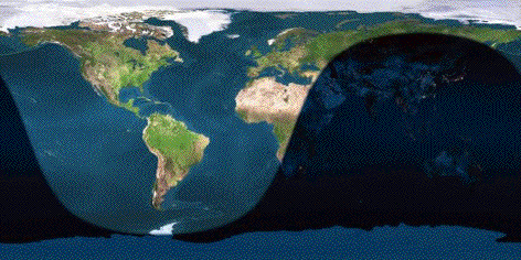
The image on the left shows the daily incident solar energy intensity on July 4. The highest values of energy intensity (dark red) are in the arctic region due in part to the 24 hour day above the Arctic Circle while the Earth’s Northern Hemisphere is tilted towards the Sun. Because of cloud and ice cover, a high fraction of this energy will be reflected back to space and will not heat the surface of the Earth. On this date, the South Pole region experiences 24-hour darkness and is shown in black.
Make a Prediction: Before you view the solar energy animation, guess in which month the solar intensity will be greatest and in which month it will be the least for your hometown.
15. In what town and state do you live? ____________________________________
16. During which month do you think solar intensity is greatest at your home? __________________
17. During which month do you think solar intensity is least at your home? __________________
Click the Solar Energy Animation link. (Note: Because of the file size, give the web page time to download its images.) Manipulate the computer model until you feel comfortable with it. Then return to page 13 for further instructions
18. Use the computer model to determine the daily energy values for your home and for the
Equator at the beginning of each month. Use the drop-down menu to select the
months January through December. Look at the color changes on the map and use the legend below the map to determine energy values.
Location |
Jan 1 |
Feb 1 |
Mar 1 |
Apr 1 |
May 1 |
Jun 1 |
Jul 1 |
Aug 1 |
Sep 1 |
Oct 1 |
Nov 1 |
Dec 1 |
|---|---|---|---|---|---|---|---|---|---|---|---|---|
| Wash., D.C. | ||||||||||||
Equator |
Note: The colors shown on each map may be used to determine the total energy (i.e., ignoring atmosphere absorption/reflection) provided by the sun within an area of 1 square meter above the atmosphere for the date shown. In the image, from January 1, Washington, D.C., lies in the middle of the dark blue color on the map, which means on January 1 the Sun provided the Washington D.C. region approximately 0.3 x 10⁸ J/m2 during a day. On a very clear day, approximately 80% of this energy passed through the atmosphere.
Sample values for Washington D.C. and the Equator are shown below.
Location |
Jan 1 |
Feb 1 |
Mar 1 |
Apr 1 |
May 1 |
Jun 1 |
Jul 1 |
Aug 1 |
Sep 1 |
Oct 1 |
Nov 1 |
Dec 1 |
|---|---|---|---|---|---|---|---|---|---|---|---|---|
Wash., D.C. |
1.4x10⁷ |
1.8x10⁷ |
2.4x10⁷ |
3.1x10⁷ |
3.8x10⁷ |
3.8x10⁷ |
3.8x10⁷ |
3.8x10⁷ |
3.2x10⁷ |
2.6x10⁷ |
1.8x10⁷ |
1.4x10⁷ |
Equator |
3.2x10⁷ |
3.4x10⁷ |
3.6x10⁷ |
3.6x10⁷ |
3.2x10⁷ |
3.4x10⁷ |
3.2x10⁷ |
3.4x10⁷ |
3.4x10⁷ |
3.4x10⁷ |
3.2x10⁷ |
3.2x10⁷ |
Explain: Use the values you recorded in the table to answer the following three questions:
19. In which month was solar intensity the greatest in the following locations?
Your home? Washington, June-July
Equator? March-April look highest but values don’t change much during the year
20. In which month was solar intensity the lowest in the following locations?
Your home? Washington, January
Equator? December-January
21. How accurate were your earlier predictions of times of the year when solar intensity is highest and lowest at your home?
Answers may vary. Typically, as in the case of the daily energy cycle, assuming predominantly clear conditions, solar intensity may peak a few months before surface temperatures are highest. Clouds and local weather patterns will moderate the surface temperature at a selected site.
Explore: Sea Surface Temperatures
How does solar radiation affect sea surface temperatures?
Examine sea surface environment data that are superimposed on a map and incorporated into a computer model that can be manipulated. Click the Sea Surface Environment visualizer.
Set the visualizer controls to,
Year: 1981
Month: November
Parameter: Temperature.
Observe the map generated and answer the following questions.

22. Describe information provided by the colored image. What does the image depict? What do the colors represent? What do the numbers along the sides of the image represent?
The colors of the image represent sea surface temperatures measured over the week of November 8, 1981. It is important that students are able to accurately read maps: The top of the map is north, the bottom is south, the left is west and the right is east. A natural coordinate system (i.e., near spherical objects) employed for planets and moons uses angles of longitude and latitude to identify locations. The numbers across the top and bottom of the map give longitude values. The numbers on the right and left side of the map give latitude values. At the Equator, latitude = 0o, at the North Pole, latitude = 90o (or 90N) and at the South Pole, latitude = -90o (or 90S).
23. What patterns do you see in the November 1981 Sea Surface Temperature data (SST)?
Temperatures vary with latitude.
24. Where are the water surface temperatures coldest?
Temperatures are coldest near both poles.
25. Where are the water surface temperatures warmest?
Temperatures are warmest near the Equator.
26. Do you see regions where cool surface water moves into latitudes where warm surface water dominates?
Western coasts of South America and Africa
27. Do you see regions where warm surface water moves into latitudes where cool surface water dominates?
Scandinavia, north of Europe
Next, return to Sea Surface Environment data visualizer.
• The Click-On-Map Data selector determines the type of data displayed when you click on any 5o x 5o ocean site on the map. You can select a graph or a table of median parameter data for each site and each available year.
• Set the Click-On-Map Data option to Graph and click an ocean region near the Equator. A time series graph will appear showing you how the sea surface temperature at that site varied over the years. For example:
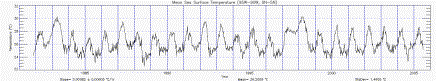
The graph above shows sea surface temperatures at a selected site near the Galapagos Islands. Before interpreting any graph, including this one, make certain that you understand what the x- and y-axes represent. Answering the following questions correctly is critical to reading this graph accurately.

28. What is measured on the x-axis?
Time in years
29. What does each vertical line (blue) on the graph represent?
One year
30. What is the range of the entire graph?
1981 – 2005
31. What does each horizontal dot on the graph represent?
Month of the year
32. What is the month and year that data were first shown on this graph?
November 1981
33. What is measured on the y-axis?
Temperature in degrees Celsius
34. What does each graduation on the y-axis represent?
.5 oC
35. The graph shows data that vary considerably from year to year. Complete the
following chart by identifying three years when sea surface temperature was highest and
three years when it was lowest.
Mean Sea Surface Data (95W – 90W, 0N – 5N) |
||||||
Highest Temperatures |
Lowest Temperatures |
|||||
|---|---|---|---|---|---|---|
Year |
1983 |
1987 or 1992 |
1998 |
1985 |
1988 |
2004 |
Month |
April |
April |
March |
August |
July/August |
August |
Temp oC |
30.2 |
29.5 |
30.2 |
23.2 |
22.6 |
23.3 |
36. If during a certain year, many widespread sites experience the same unusually high or
low temperatures, there is good reason to look for the cause of such behavior. To study the
effects on other types of data and to see how the unusual temperatures affected the weather
of the region, complete an analysis of one more site off the east coast of North America.
Mean Sea Surface Data |
||||||
Highest Temperatures |
Lowest Temperatures |
|||||
|---|---|---|---|---|---|---|
Year |
||||||
Month |
||||||
Temp oC |
||||||
To develop a measure of how unusual, or normal, a data value may be, one needs some measure of both. To quantify data values as normal or unusual, people often compute two measures from their data:
• Mean—a weighted or unweighted average of data values
• Standard deviation—measures the scatter of data values with respect to the mean value
Earth Image from The Living Earth
http://www.fourmilab.ch/earthview/
2006 May 21 16:34 UTC
Elaborate: Temperatures Travel The Pathways Of The Sea
When you examined the sea surface temperature map earlier, you were asked to identify regions where cool water intruded into regions of normally warm water, and where warm water intruded in regions of normally cool water. One of the regions where cool water intrudes into a region of warm water is in the Eastern Pacific near the west coast of South America. The reason for this intrusion is the flow of surface currents. Shown below is an Ocean Surface Currents data computer model that uses OSCAR data showing ocean surface currents around October 15, 1992. The gray area on the right of the map shows part of the west coast of South America. The white area along the coast of South America has no data. The arrows show the direction of the currents and the current speed in meters per second.

37. What speed do the following colors represent?
Magenta - 0 m/s
Darker blue - 0.3 m/s
Lighter blue - 0.5 m/s
38. In what direction do the surface currents just south of the Equator appear to travel?
East to West.
39. Note in the southeast corner of the map a strong (blue) current flows along the coast of South America. What is the direction of this current?
North and Northwest
The current moving up the western coast of South America is mostly westward flowing filaments of cold water. It is a surface current that includes Ekman transport. The westward-moving current along the Equator is called the Pacific South Equatorial current. These currents are very important for understanding the dynamics of El Niño.
The currents you’ve seen in the tropical Pacific provide an example of currents that circulate and mix warm and cool waters. This circulation helps moderate global temperatures.
The ocean influences the climate in a myriad of ways. Seemingly subtle changes in ocean currents, temperatures and salinity can impact winds and weather patterns throughout the world. Even the distribution and abundance of marine organisms can affect climate. Likewise, changes in air temperatures, winds, and precipitation affects the dynamics of the ocean. Climate cycles and anomalies such as El Niño and the North Atlantic Oscillation all involve the complex interplay between ocean and atmosphere. And now scientists are scrambling to learn how the warming of the atmosphere due to the increase of greenhouses gases will alter this dynamic.
Additional Investigations For Energy Balance In The Earth System
Students are encouraged to search for weather and climate variations through use of the Sea Surface Environment Visualizer - ../../html/resources/ssedv.htm and the OSCAR Visualizer - ../../html/resources/oscar.htm
Students may research their theories about climate and weather by read the articles in the Impact section of the Ocean Motion web site, listed below or by searching the World Wide Web.
El Niño
Global Warming and Atlantic Currents
../../html/impact/globalwarming.htm
Global Warming Weakens Winds
../../html/impact/weakwinds.htm
Satellites Record Weakening North Atlantic Current
../../html/impact/climate-variability.htm
Evaluation: Matrix For Grading Lesson 5
4 Expert |
Responses show accurate identification of graphs used to explain manipulation of sample data. Shows solid understanding of the model of the human body to explain energy balance in Earth system. Proficient interpolation of graphs to show diurnal heating and cooling cycle of the atmosphere. Proficient manipulation of computer model to read near real-time satellite data, and analysis of data is complete and accurate. |
3 Proficient |
Responses show accurate understanding of models and analogies used to explain scientific concepts and processes used in the lesson. Shows good understanding of the model of the human body to explain energy balance in Earth system. Mostly proficient interpolation of graphs to show diurnal heating and cooling cycle of the atmosphere. Mostly proficient manipulation of computer model to read near real-time satellite data and analysis of data are mostly complete and accurate. |
2 Emergent |
Responses show partial understanding of models and analogies used to explain scientific concepts and processes used in the lesson. Shows some understanding of the model of the human body to explain energy balance in Earth system. Mostly proficient interpolation of graphs to show diurnal heating and cooling cycle of the atmosphere. Somewhat proficient manipulation of computer model to read near real-time satellite data and analysis of data are partially complete and accurate. |
1 Novice |
Responses show very limited understanding of models and analogies used to explain scientific concepts and processes used in the lesson. Shows limited understanding of model of the human body to explain energy balance in Earth system. Mostly proficient interpolation of graphs to show diurnal heating and cooling cycle of the atmosphere. Limited or no ability to manipulate computer model to read near real-time satellite data and analysis of data are not complete. |
![]() for compliance with Section 508.
for compliance with Section 508.